
Fresh Fit Meals Case Study
Fresh Fit Meals Case Study


Product: Responsive Site
Duration: 1 Month / 80 hours
Role: UX/UI Designer
Fresh Fit Meals is a brick and morter, health and fitness focused meal prep restaurant located in Des Moines, IA. Their current site builder was falling short of their goals and had a need to redesign their current responsive site to support quick & easy ordering, signing up for subscriptions, and create meal packages + plans.
It should be easy to have food that supports our bodies and lives – and fresh Fit meals Makes That possible.

Having a background in health and wellness, I know how important it is to be thoughtful in giving our bodies daily fuel and nutrition, and what better way to do this consistently than meal prepping.
However, the general consensus between personal experience and User Research being the following:
Most people don’t feel they have time to meal prep on their own.
Most people default to foods that are less nutritious because they feel they save time
People think it will be expensive or complicated to outsource meal prepping
Introducing: The new and improved Fresh Fit Meals


The solution for easy meal prep and nutrition: by combining easy online ordering, weekly meal packages, personalized meal plans, and in-store subscriptions; Fresh Fit Meals allows customers to have peace of mind and clarity around their daily nutrition – all while saving time, from one convenient touch point.
My Process
STARTING AT THE BEGINNING, I ASKED MYSELF, how Does FFM compare to other sites and services?
In order to discover user needs and wants, I utilized Secondary Research and User Interviews.
I discovered that outsourcing to an ordering software like Toast is a best practice for a restaurant of this size, however there were some sites that did this better than others by embedding part of the selection process directly on their site before sending them to the ordering software. This truly created a seamless experience for the user.
Successful sites also put an emphasis on high quality photos of available food choices.
The opportunity I saw was the ability to upgrade the current site to create more fluidity and user appeal.


I then used User Research to discover what users truly needed and wanted when it came to ordering, in store subscriptions, and meal plans.
We found that there were some barriers to a seamless user experience in the current site map and description of services.
1. it was difficult for users to tell that FFM offered meal packages without needing to consult a dietitian (high barrier to entry).
2. the ordering flow had too many steps and often crashed mid order.
3. the current model for in store subscription had day/time restrictions which would make users rethink purchasing.
An interesting and unexpected insight being: the interviewees highlighted a need for “On-the-fly” Ordering.


There’s a Market for that
The main features and functions interviewees highlighted as being important in their meal prep process were:
1. The option to both plan ahead and order on the fly outside of a package
2. A flexible in store subscription
3. Being able to fully personalize a meal plan
4. Clarity on full ingredient lists + the ability to easily identify and avoid allergens
Through my interviews, I found there were three types of meal prep enthusiasts:
Becky, the busy parent looking for convenient choices that fit her dietary needs
Giorgio, the on-the-go athlete looking for the ability to both plan ahead and order on the fly
Joe, the health-focused entrepreneur who desires clarity of ingredients
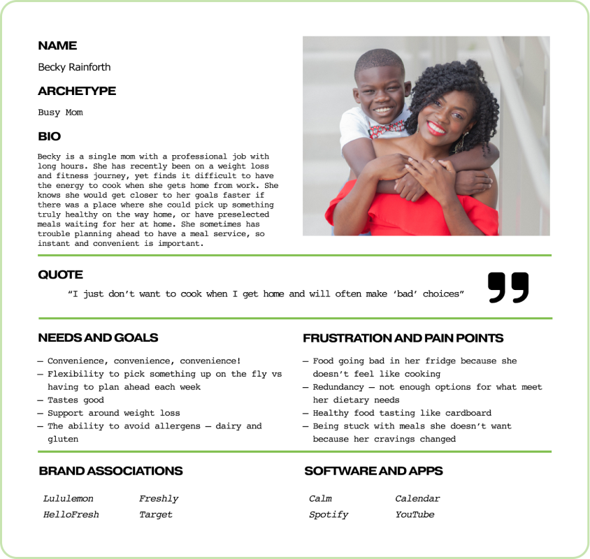


The main piece that defined these personas is they all had a need for more convenience in their lives
Based on User interviews, I created a series of statements to direct my work on the Fresh Fit Meals site:



It became clear that in order to implement any of these features effectively, it would be important to prioritize and focus.
For the core experience, I chose to focus on Giorgio and Becky’s personas by working with the owners to design and implement a more user-friendly flow for the various Meal Plan features with Signup and Purchasing functions designed specifically for Fresh Fit Meals, along with a more integrated approach to Online Ordering .
This would support clarity and efficiency for the users as well as the business goals of generating more orders and meal plan subscriptions for the restaurant, whereas focusing on Niche Wellness or Micronutrients could be a way to add further value in the future.
→
Meal Plan Signup

A meal plan sign up flow that allows the user to customize their plan to their preferences.
Meal Plan Checkout

A checkout process that is designed specifically for FFM and utilizes ease-of-use tools like ApplePay to promote increased checkout completion.

Online Ordering
A more integrated version to online ordering that, even though the ordering process is outsourced, allows the process to feel like part of the original site and user experience.
Focusing on a seamless signup and Meal planning experience would create the greatest value for the most users.
Within the one month timeframe, I chose to focus on a restructured sitemap and creating separate user flows for each experience the business offered. The restructured sitemap helped the users truly understand everything Fresh Fit Meals had to offer in order to increase sign-ups, orders, and profits. The current current user flows just needed some minor updates to be more user-friendly.
Supporting flows include Online Ordering integration.

FFM Sitemap

Order Online

Personalized Meal Plans

Weekly Meal Package

In-Store Subscription
IF I WAS Becky, I WOULD WANT TO HIT A FEW BUTTONS AND know my Meals are ready to go, that would be my ideal Solution
Low fidelity wireframes
The Low Fidelity Wireframes gave a rough outline for when and where to place different elements + the components needed to make the user flows a reality.

Working with an existing company presented the constraints of working with pre-ordained logos and brand colors.
Even so, the current logo had quite a few detailed elements and on certain pages, was not scaling cleanly. It is a best practice to simplify a logo as much as possible to create memorability, so I presented a logo redesign using FFM’s same font and color scheme.
Fresh FIt Meal’s brand captures the essence of healthy eating, Appetizing food, and the excitement of change.

I also adjusted the brand colors to feel slightly more natural and lived in by softening the colors slightly and skewing from a true white background (#FFFFFF) to slightly off white on the green spectrum (#FDFFFB) in order to subconsciously feel more inviting and professionally curated.
I then created a submark based on my logo redesign to be used more effortlessly on mobile screens.
Feedback gathered from my rounds of user testing included:
Users found the prototype aesthetically pleasing without being overwhelming.
The process for each flow made sense to the users, the least user friendly part of the flow being the stand in frames for Toast, Google Calendars, etc. It did not make sense to build out portions completely in the 80 hr time frame, so no further iterations were needed.
The only necessary iterations involved resolving some usability issues around a few components looking similar to buttons.

The Future of Fresh Fit Meals Looks Bright
Although it is recommended to outsource on-the-fly ordering for now, as the business scales it will be worth looking into bringing this service in-house, designing a personalized ordering experience for FFM users.
In the future, FFM may look into incorporating more information/attention to micronutrients to broaden their client base and provide the best experience for all users.
