
MyMove Case Study
MyMove Case Study


Product: Responsive Site
Duration: 2 Months
Role: UX/UI Designer
MyMove is a responsive site designed to help users feel ready and prepared to move – whether local, cross country, with or without children, and more. By creating interactive, professionally developed moving checklists synced straight to your personal calendar, MyMove is designed to increase affordability, reduce stress, and help users have the space and clarity to enjoy their next adventure.
Moving should be about the Excitement of your next adventure, Not stressing the details


I personally love moving and the thrill of new opportunity it brings. However, it is objectively stressful.
The general consensus between personal experience and User Research being the following:
It’s stressful, overwhelming, and expensive
People currently have to spread planning a move across multiple apps and tools
Moving always takes longer than users imagine, they typically feel like they are “forgetting something”
Unforeseen issues cost them unecessary money
Introducing: MyMove

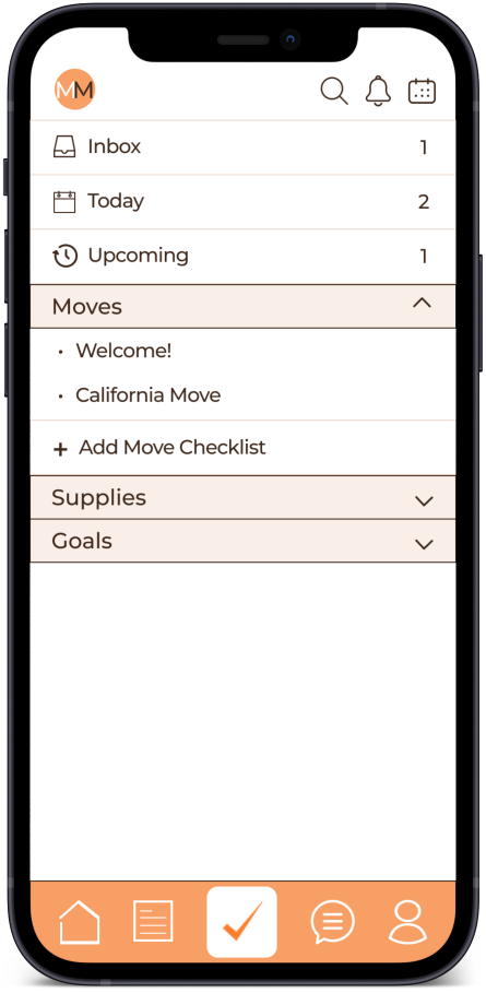

The solution for disjointed moving prep and execution: by combining pro-mover created checklists, productivity tracking, community collaboration with other movers, and the ability to sync all of this to your personal calendar; MyMove allows users to have peace of mind and clarity of spending by knowing their move is on track, all from one convenient touch point.
My Process
STARTING AT THE BEGINNING, I ASKED MYSELF, how is there not an easier solution for Moving yet?
In order to discover user needs and wants, I utilized Secondary Research and User Interviews.
While analyzing the apps and sites I used when moving, I began to notice that the apps did bits and pieces of the planning process, but none provided the full service of organizing, planning, and executing a move (or if they did, they had terrible reviews and a terrifyingly out-of-date interface).
The opportunity I saw was the ability to combine all of those needs into one fluid experience that saved time & money while reducing overwhelm.


I wanted to gain a better understanding of the potential opportunity + target users for the app. I conducted remote interviews with young professionals in their 20’s and 30’s, with and without children, who admitted to finding moving “overwhelming or stressful”.
I focused my questions around how they planned their past moves as well as their likes and frustrations around the planning + moving process.
An interesting, universal insight being: every single interviewee used the exact same words to describe moving: Stressful and Exciting




There’s a Market for that
Through my interviews, I found that there were three types of movers:
Will: the hyper-organized mover looking for good help
Payton: the thrifty free-spirt seeking to save money
Brenna: the young mom who wants to KNOW she is prepared for her move
The main features and functions interviewees highlighted as being important in their moving process were:
1. A vendor marketplace with an accurate rating method
2. Checklists and productivity trackers + calendar sync.
3. Being able to previsualize their furniture in a new space
4. A way to categorize and log packed items


BY REMOVING THE TIME-CONSUMING APP-HOPPING AND coordination, YOU GET BACK the time you have left to enjoy where you are and the people you have now.
Based on User interviews, I created a storyboard to direct my work on the MyMove site:

It became clear that in order to implement any of these features effectively, it would be important to prioritize and focus.
→
For the core experience, I chose to focus on Brenna and Payton’s personas by designing and implementing the Checklists feature with the Productivity and Calendar Sync functions.
This would support both affordability, efficiency, and clarity around the moving process, whereas Logging and Categorizing Items or Previsualizing the New Space would not be as helpful as a stand alone function, and a Vendor Marketplace would only support those looking to hire vendors.
Focusing on Productivity for the sake of affordability would create the greatest value for the most users.
Within the two month timeframe, I chose to focus on Payton and Brenna’s user flows as my initial personas. With the assumption that users like Payton and Brenna, who are more focused on organization, prioritization, and saving money, would have more opportunity to utilize the core feature of the app: Checklists.
Supporting flows include Account Creation and Messaging.
Account Creation


Checklists

Send a Message

IF I WAS Payton, I WOULD WANT TO HIT A FEW BUTTONS AND know my move was ready to go
Mymove’s brand captures the Excitement and delight of change, with the grounded nature of having a plan to do so.
With the layout from the wireframes, I began to build MyMove’s brand. I built a style guide that encompassed MyMove's modern aesthetic accented with bright colors – the excitement of orange yet calming, grounded nature of teal – and a clean, refined typeface.

Based on the style guide, I created high fidelity mockups for the screens and built a Figma prototype to capture the user journeys through the app and walk the user through key flows.
Insights gathered from my rounds of user testing included:
Onboarding steps were too long and users felt like they would prefer to wait to be presented with a paid plan
Users wanted the option to skip straight to the value vs. being forced to set up a profile initially
Users continue to feel this is a valuable product and can see how it would fit into their lives and improve their moving process
Users wanted to see updates to the home page, for example a “welcome” to make it apparent they’re on the home page.


Improvements
With the information gathered from usability tests, I created a second iteration that offered users an expedited sign up process, the ability to skip straight to the value add (aka, Checklists), and waiting until after the sign up process to present users with the paid plan.
In addition, although MyMove does offer a single experience to plan the process leading up to a move, users still feel that Logging and Categorizing + Previsualizing their New Space would be particularly useful parts of the app. Because of this, I would explore adding these functions in later site updates to offer users an even more fluid moving experience.

