
Spectra Case Study
Spectra Case Study


UX Design & Research
Duration: March-June 2025 (Initial 2-month contract, extended 2 months)
Role: Lead UX Designer
Team: UX Designer partnering with Sales, Engineering, Marketing, and Product leadership
“We’re Creating Something Brand new, and while we’re building it from the ground up, we want to change our consumer facing branding and UI to fit the direction we’re heading as a company.”

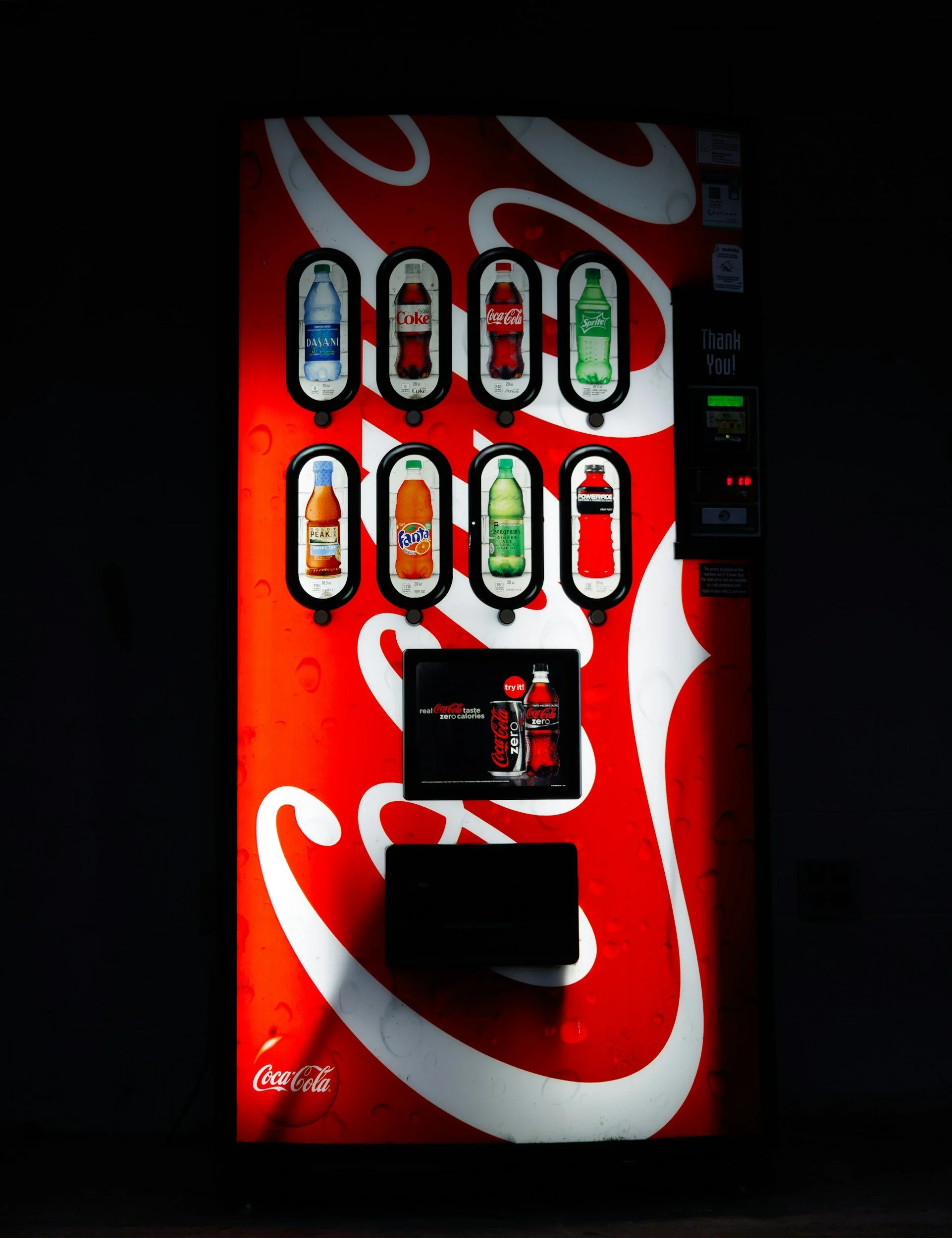
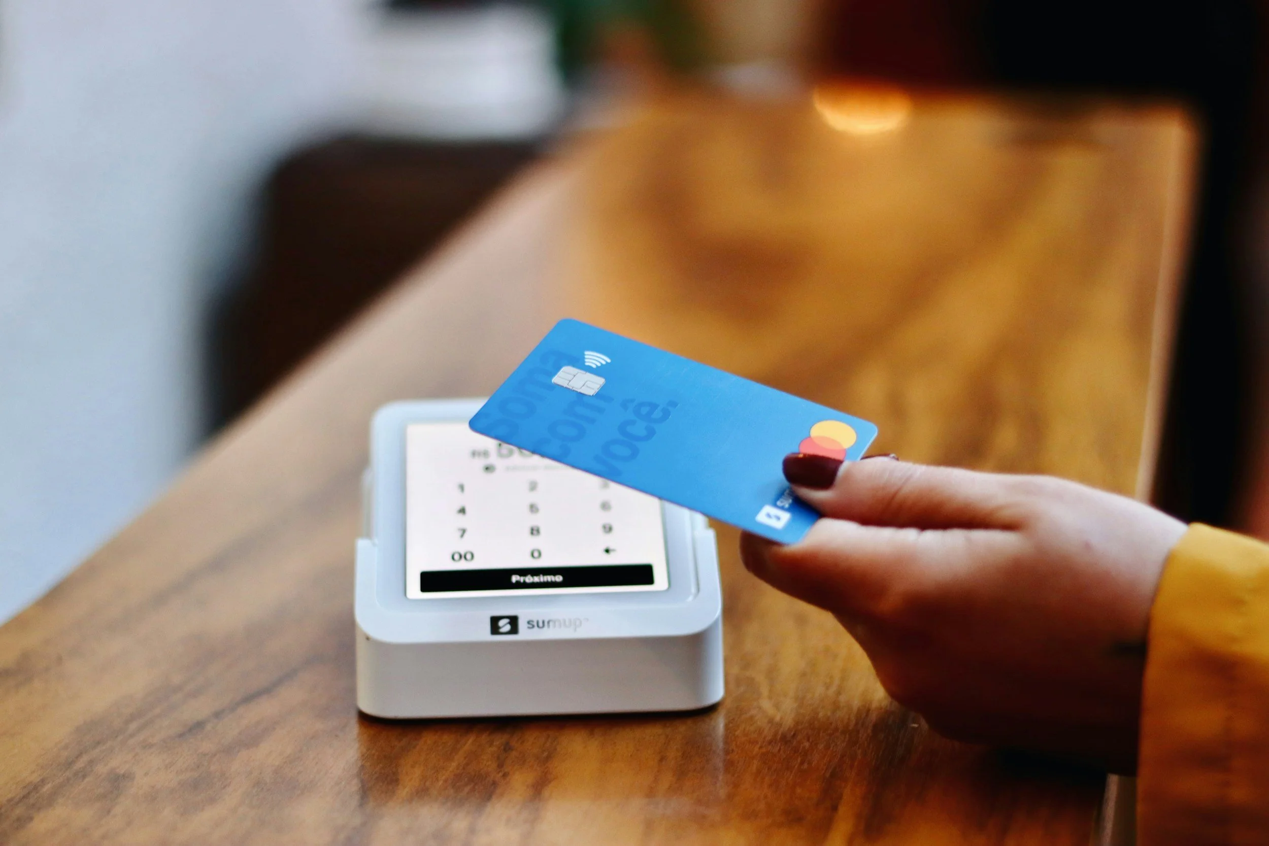
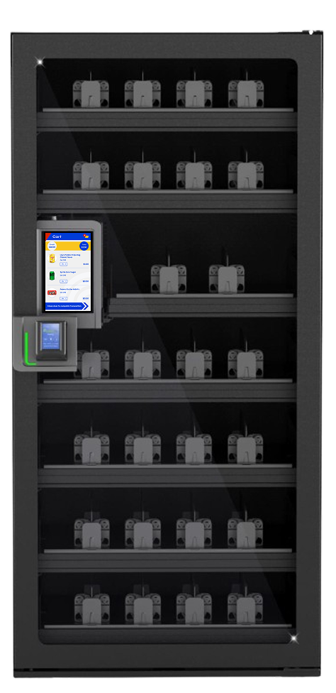
The Wittern Group, a 90+ year-old family-owned vending machine manufacturer, was developing the Spectra—a new tap-to-pay, zero-touch micromarket vending machine. Users tap to pay, open the door, grab items (automatically added to cart via hand/item triangulation), return items (removed from cart), and close the door to checkout—similar to Amazon Go but in a compact machine form factor.
I was initially brought on for a 2-month contract to execute a company-wide brand refresh across consumer-facing screens, the operator backend, and the new Spectra UI. Through creative user feedback gathering and strategic advocacy, I built buy-in for larger research initiatives (including the later InDEX project), successfully extended my contract by two months, and influenced hardware/software changes for a more automated, user-friendly experience.
Problem Statement
Wittern needed a cohesive brand experience that felt friendly, approachable, nostalgic, and gamified (leadership directives). The UI had to support a seamless zero-touch flow on the Spectra while also supporting traditional vending machines. We also needed to avoid common vending frustrations (e.g., slow checkout, confusing feedback, operator setup pain).
Leadership had clear preferences but limited user data; I needed to bridge their vision with real user behavior and best practices across three distinct user sets:
Owners/customers (business decision-makers who purchase and manage machines)
Operators (field staff who restock, maintain, and service machines)
End consumers (everyday users buying snacks/drinks)

Introducing: the Spectra
Seamless micromarket experience in a compact machine—tap, grab, return, close, pay—all at users’ fingertips.
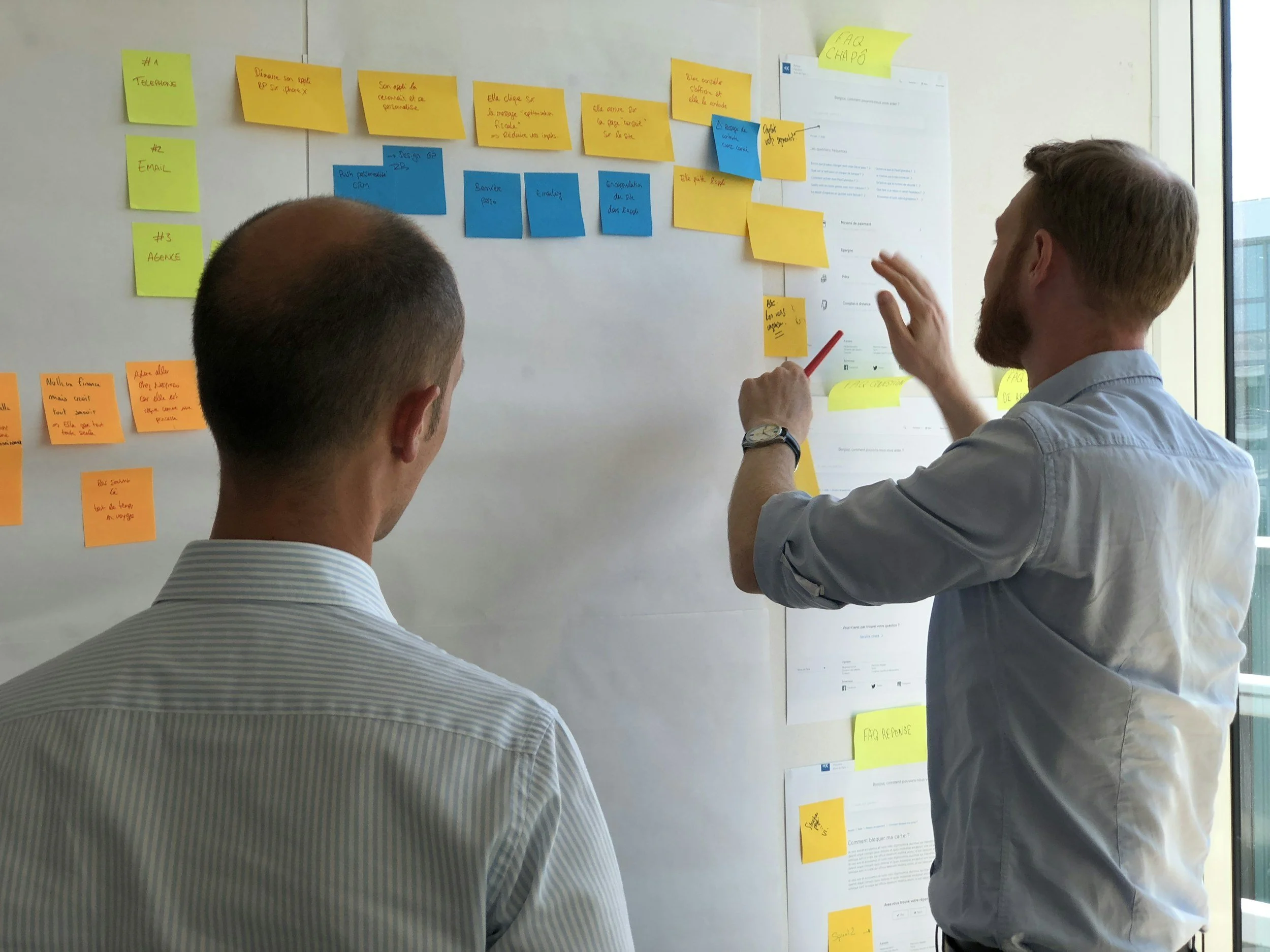
Research & Discovery
I approached the project with three user lenses in mind and gathered input accordingly:
Direct customers: Leveraged existing sales relationships and recorded Voice of the Customer (VOC) calls to understand business priorities, pain points with legacy machines, and expectations for Spectra (e.g., ROI drivers, setup simplicity, reliability). This gave me insight into strategic needs like reduced manual configuration and higher sales lift.
End consumers: Conducted contextual inquiries at local micromarkets, traditional vending machines (offices, malls, airports), and self-checkout locations to observe real purchase behaviors—especially around quick grabs, payment friction, cart visibility, error recovery, and emotional reactions to zero-touch flows.
Operators: While not directly interviewed yet (due to limited buy-in for large-scale research), I inferred needs from VOC themes (e.g., manual setup frustration) and contextual observations (e.g., restocking speed, error handling).
Insights
Through contextual inquiries at micromarkets, vending locations (offices, malls, airports), and self-checkout setups—combined with sales insights and parsed VOC call themes—I uncovered several foundational learnings that shaped the brand direction, flows, and hardware recommendations:
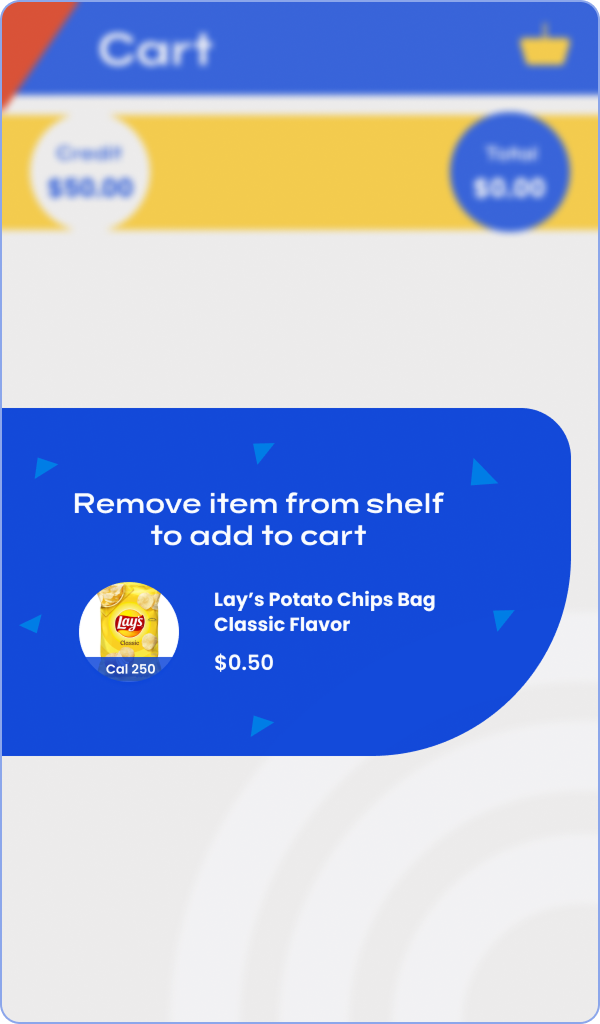
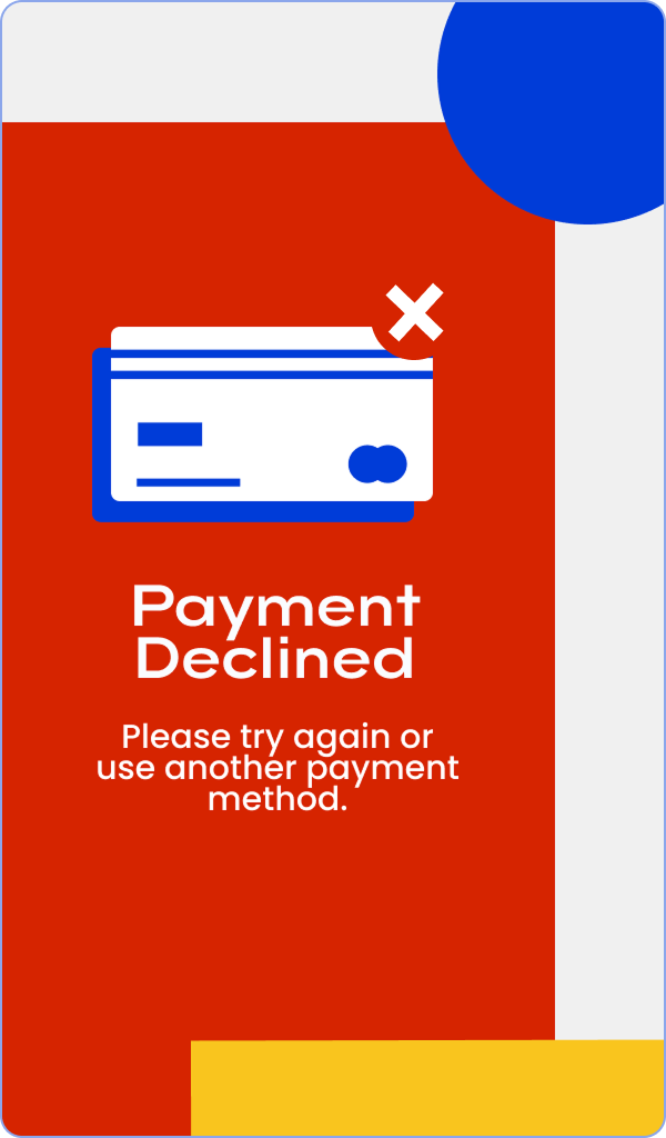
End consumers crave speed + certainty: Shoppers want near-instant feedback on what’s in their cart (visual confirmation, sound/animation cues) and clear error recovery (e.g., "item not recognized" messaging). Hesitation or confusion at any step led to abandoned purchases.
Trust is fragile in zero-touch: People instinctively double-check items/prices before closing the door. Subtle trust-builders (real-time cart visibility, friendly success animations, nostalgic/familiar branding) reduced anxiety and increased completion rates.
Operators prioritize automation: Manual setup (coil mapping, pricing, inventory sync) was a top complaint in VOC calls. Any opportunity to auto-detect or pre-configure reduced field time and errors—operators valued "set it and forget it" over complex customization.
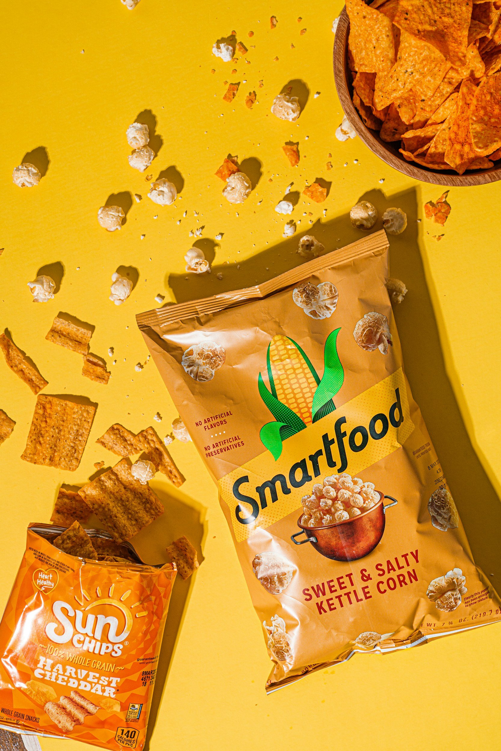
Nostalgia + appetite work: Primary colors (yellow/red/blue) and whimsical elements triggered positive emotional responses in observed snack purchases—people lingered longer and felt more "fun" about grabbing treats when the interface felt approachable and familiar (McDonald’s/Chick-fil-A vibe).
Gamified elements must be subtle: Progress bars, rewarding animations, and playful copy were well-received when they felt helpful (e.g., "Nice grab!"), but overt gamification risked feeling gimmicky to adults.
These early insights directly informed the recommended brand direction, user flows, and successful advocacy for hardware augmentations. They also proved the value of even lightweight user input, paving the way for deeper initiatives like InDEX.
Brand Direction &
Design Process
Leadership provided four keywords: friendly, approachable, nostalgic, gamified.
I created 5 distinct brand directions, each with mood boards, color palettes, typography, icon styles, and sample screens. I recommended one clear favorite based on:
Design best practices (visual hierarchy, accessibility, emotional resonance)
Alignment with keywords
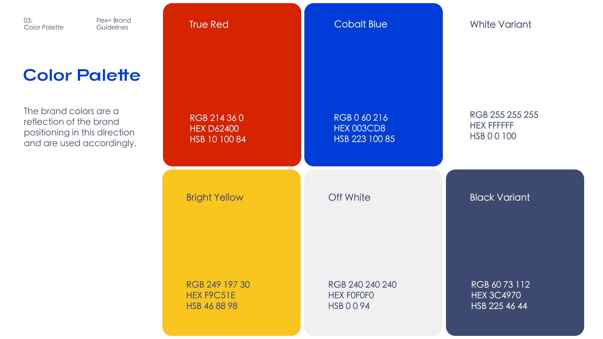
Color psychology for snack vending (primary colors yellow/red/blue stimulate hunger/appetite, as seen in McDonald’s, Wendy’s, Chick-fil-A)
The recommended direction used:
Bold primary colors (yellow/red/blue) for nostalgia and appetite stimulation
Whimsical shapes and friendly copy tone for approachability
White backgrounds on functional screens for clarity and friendliness
Subtle gamified elements (progress indicators, rewarding animations) without overwhelming the experience
Leadership surprised me (given their conservative history) and selected this bold direction.
Design Deliverables
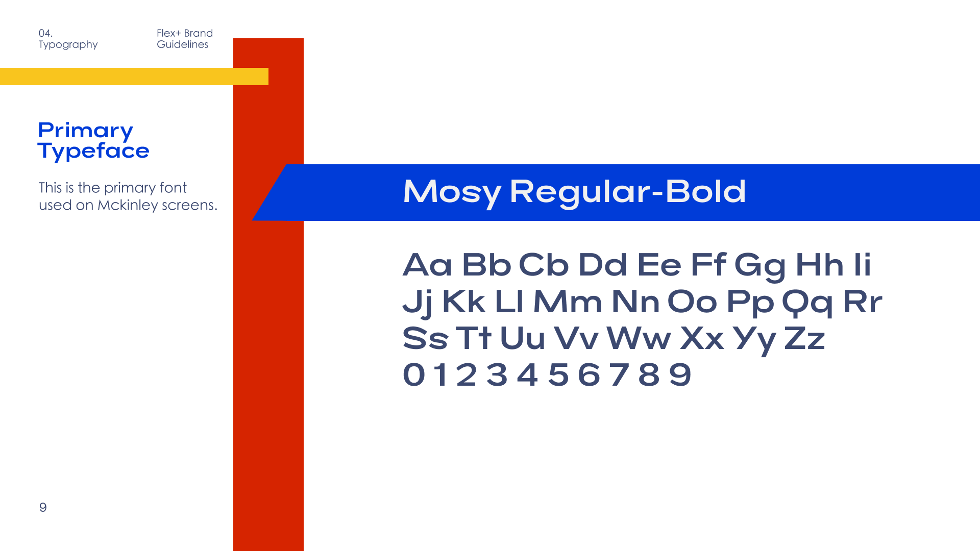
Branding guidelines
The brand guidelines document codified the approved direction across the entire Spectra ecosystem, providing clear rules for consistent application while allowing audience-specific flexibility.
Built on primary research insights (contextual inquiries, VOC synthesis, sales feedback), the guidelines balanced emotional resonance (hunger stimulation, joy, trust) with functional clarity, while allowing deliberate adaptation for different user sets.
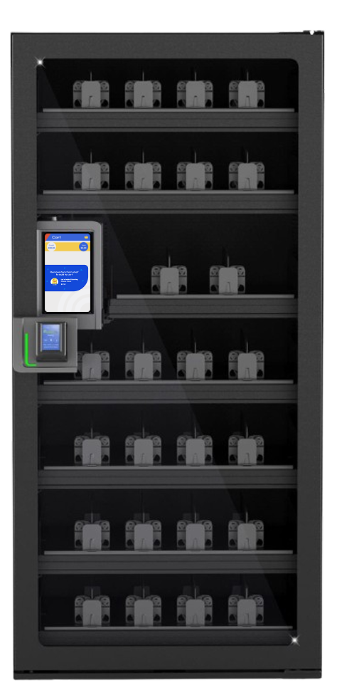
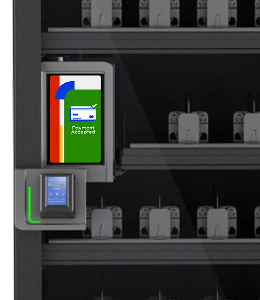
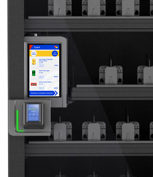
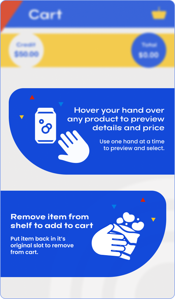
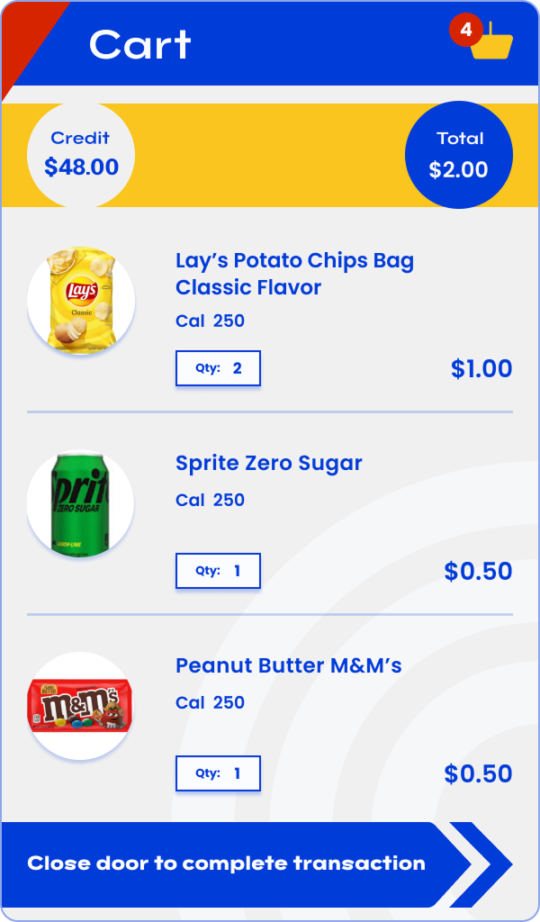
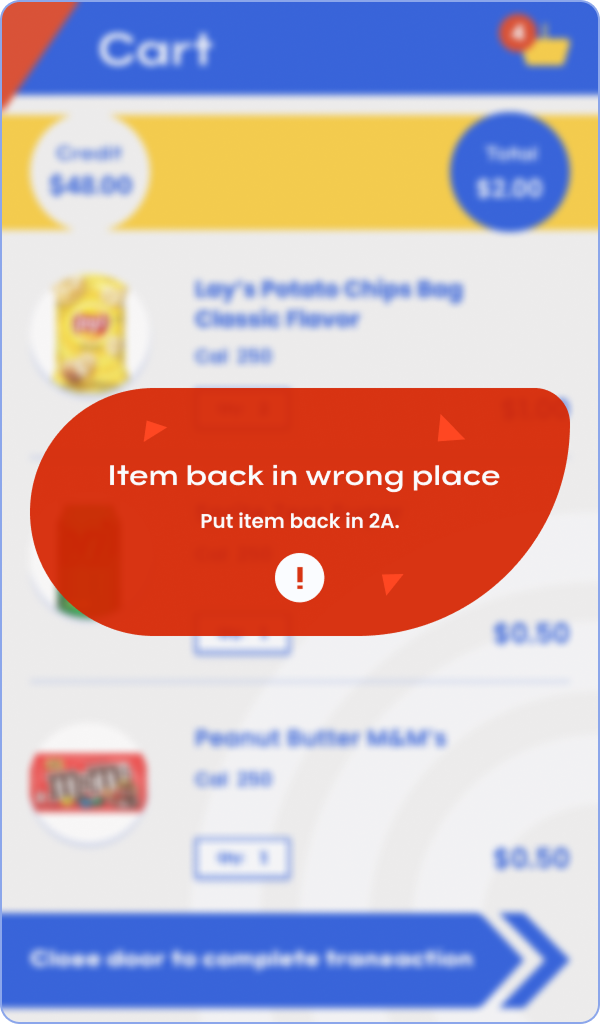
High Fidelity Wireframes – Consumer Facing
The consumer-facing high-fidelity wireframes fully embodied the selected brand direction—conceptualized around leadership’s four keywords: gamified, friendly, approachable, and nostalgic. They incorporated bold primary colors (yellow, red, blue) to evoke hunger and nostalgia, whimsical shapes for playfulness, rewarding animations for gamification, and friendly font and copy tones for approachability.
Critically, these screens also integrated functional insights from contextual inquiries, VOC calls, and sales feedback—ensuring real-time cart visibility, clear error messaging, intuitive feedback cues, and trust-building elements that addressed observed end-consumer behaviors (speed, certainty, reduced anxiety in zero-touch flows).

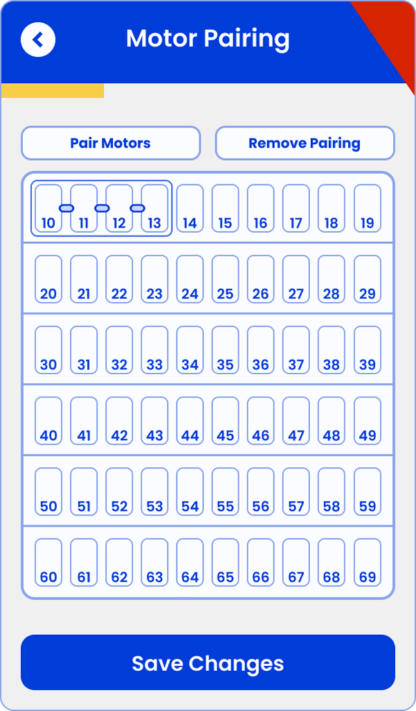
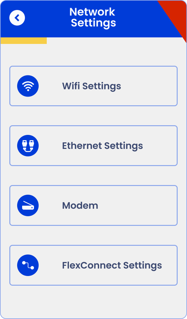
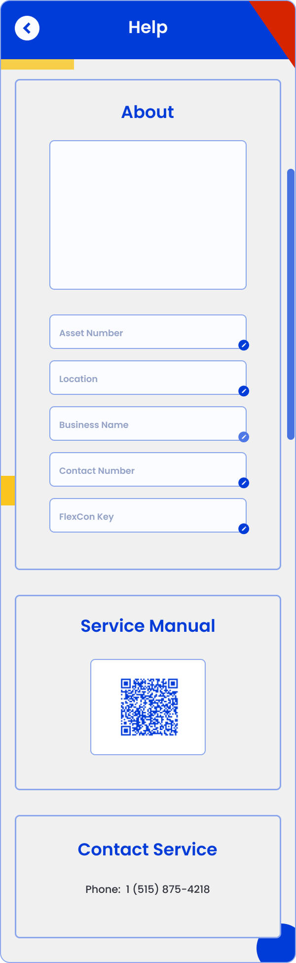
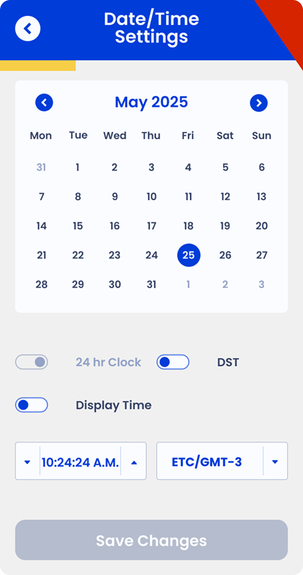
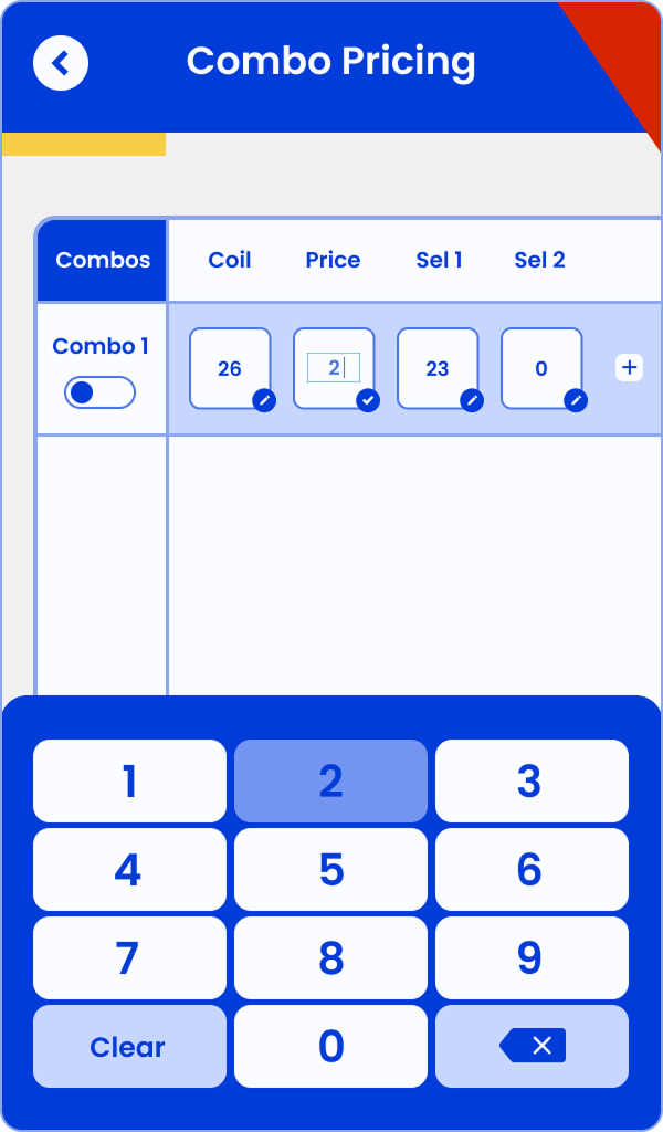
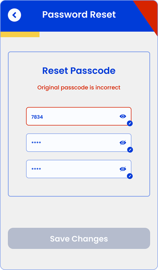
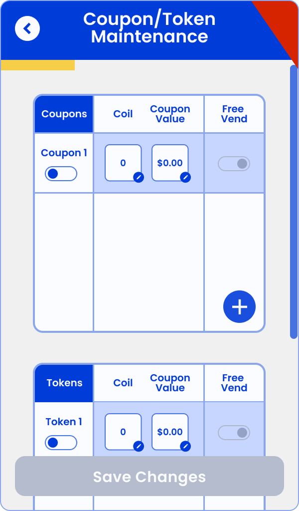
High Fidelity Wireframes – Operator Backend
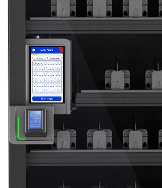
For the operator backend, I adapted the branding into a simplified, more utilitarian version that prioritized functionality, trustworthiness, and consistency over fun, gamification, attention-grabbing visuals, or hunger-inducing cues. We dialed back whimsical elements and bold colors, opting for clean layouts, high-contrast readability, streamlined navigation, and focused utility so operators could complete tasks (restocking, configuration, monitoring) quickly and without distraction. This version maintained brand coherence across the ecosystem while aligning with the practical, efficiency-driven needs of field staff.
Outcome:
Together, these deliverables created a cohesive yet audience-specific experience across all three user sets—owners, operators, and consumers—while staying true to both leadership guidance and real user needs uncovered through research.
"The software I use pulls the DEX data from each machine to build the layout for the planogram... it never has any issues being pushed to the machine... It is very smart." — VP Prestige Solutions.
Influence without Authority
Through the design process, I advocated for hardware/software augmentations to reduce operator setup pain and improve automation (e.g., auto-detection of certain machine states). I presented evidence from contextual inquiries and VOC analysis to influence engineering without direct authority—resulting in changes that made the experience more seamless for both users and operators.
I also successfully extended my contract by two months by demonstrating ongoing value in updating operator backend functions alongside the brand refresh.
Usability Testing
Once software implemented the new screens, we conducted usability testing with a small group of internal users and a few external operators (recruited via sales). Key activities:
Task-based sessions (simulate purchase flow, return item, handle errors)
Think-aloud protocol to capture confusion/frustration
Post-task ratings (ease, clarity, friendliness) and open feedback

Findings:
High success on core flow (tap/open/select/close/pay) – users found it intuitive and fast.
Strong praise for visual feedback (cart updates, animations) and nostalgic/friendly tone.
Minor friction around edge cases (e.g., item recognition errors, unclear error messaging) – led to quick copy/icon tweaks.
Operators appreciated reduced manual setup; one noted it "felt like magic" compared to legacy machines.
Overall: Positive validation of the brand direction and flow; minor iterations improved clarity and confidence.
The final product
Business Impact: Halted ineffective standalone development → saved time/money. Redirected to integration into existing VMS + new snack vending segment. Positioned product for higher adoption via tiered freemium model.
Personal Impact: Demonstrated ability to lead research in ambiguous/enterprise environments, creatively overcome sourcing barriers, influence strategic pivots, and deliver actionable value that extended my contract.
Key Learnings: Operator pragmatism/low loyalty = opportunity. Creative, multi-channel recruiting is essential in B2B. Research can (and should) kill bad ideas and redirect to higher-impact paths. Holistic view (user + business + segment) drives better outcomes.